In this article:
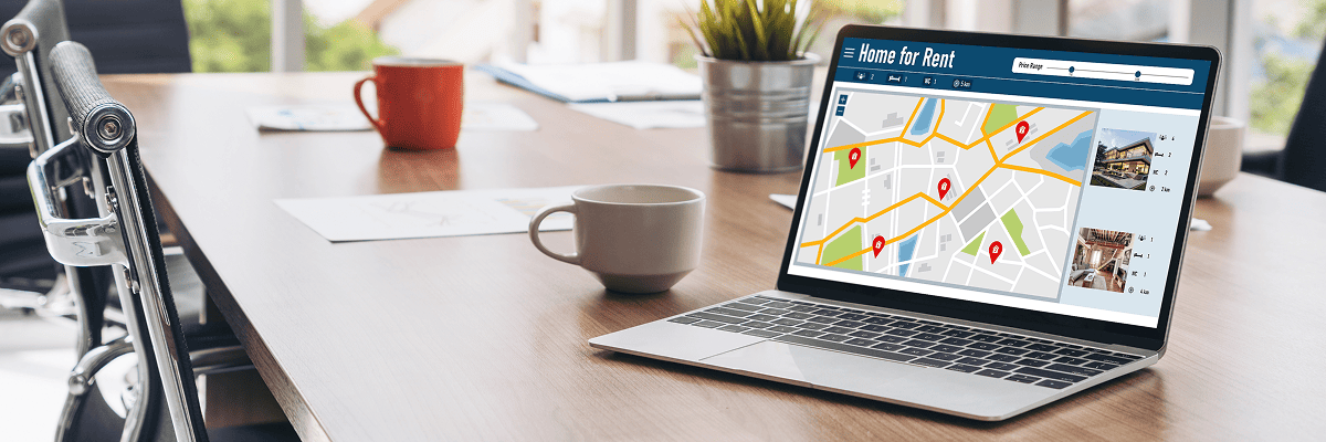
Launching a landing page for a new residential complex should feel like opening the doors to a show apartment – light, air, orientation and flow. Prospects won’t read every word; they’ll scan the promise, test the trust and then reach for a contact button if everything feels right. On Cyprus, the stakes are higher: bilingual expectations (EN/EL), international buyers with little patience and an attention economy that rewards speed over ornament. Let’s make a page that sells without shouting.
I’ll be candid throughout. Polished fluff evaporates in heat; rigorous structure endures. We’ll blend universal landing page best practices (real estate) with local nuance – currency, legal clarity and neighborhoods that actually matter to buyers.
What works in Cyprus (UX and trust signals)
Busy buyers compare you to marketplaces and portals they already trust. Your page must therefore match the convenience and beat the specificity: faster load, clearer offer, richer proof.
Bilingual EN/EL, currency, address and legal clarity
Cyprus is bilingual at the checkout moment. Serve bilingual EN/EL landing page copy without sounding like a translation. Mirror prices in euro (€, no commas in decimals), show the exact address and district and place trust badges and legal disclaimers where users expect them: near price mentions and the contact form. Add pragmatic FAQs – mortgage basics, HOA rules, delivery timelines. Nothing inflates bounce like ambiguity.
Speed, mobile UX, above-the-fold essentials
Your hero must earn its pixels. Keep page speed LCP CLS within friendly thresholds (LCP ≤ 2.5s; CLS ≤ 0.1) and design a truly mobile-first UX: sticky CTA, thumb-sized targets and no intrusive modals before intent is expressed. Above the fold, show four things: value proposition, location shorthand, indicative pricing and one primary CTA. Secondary actions (download brochure, map) can sit lower; clarity wins over choice paralysis.
Page architecture that converts
A good page reads like a guided tour: you are here → this is why it matters → here’s proof → book a viewing.
Hero → social proof → plans → location map → CTA
-
Hero section (real estate): headline in 5–7 words; subhead with the singular promise (sea view, schools, walkability); one radiant image or clean looped video.
-
Social proof and testimonials: recent buyer quotes, press mentions, third-party ratings. Avoid generic praise; cite tangible benefits (soundproofing, parking, after-sales).
-
Floor plans and 3D tours: let people “walk” before they walk. Clearly label areas, ceiling heights, storage and balcony depth. Short VR tours and virtual viewings remove doubt for overseas leads.
-
Location map and amenities: distance chips – beach 4’, marina 9’, school 12’, hospital 14’. Embed a lightweight map; highlight transit and noise-sensitive zones honestly.
-
Final CTA: “Book a viewing” or “Request availability”. Keep it singular and consistent.
Forms, WhatsApp, call-back: friction and privacy
Forms should feel like introductions, not interrogations. Ask for name + email + phone; offer WhatsApp lead capture as a one-tap alternative. Promise a call-back window and keep it. If you use a brochure gate, deliver instantly and route the lead to a thank-you page with next steps. Add privacy microcopy in plain English/Greek – no legalese walls.
Channel integration (SEO/PPC/Social/Portals)
A landing page is not a cul-de-sac; it’s a hub. It must connect cleanly to the channels that feed it and the follow-ups that convert it.
Search and maps for intent; retargeting loops
Own Cyprus real estate landing page queries with structured SEO pages that interlink to your launch. Build local clusters (district guides, school zones, healthcare) and ensure your property developer website Cyprus points cleanly to the campaign page. In paid, layer Google Ads for Cyprus property with exact match + dynamic extensions and consider Performance Max (real estate) to surface inventory across Maps/YouTube/Discover. Close the loop with retargeting funnels that respect seasonality: soft storytelling for spring, urgency during summer launches and offer testing in autumn.
UGC video, VR tours and feed-based ads
Short verticals outperform static images – buyers want a moving sense of place: lobby materials, balcony acoustics, sunset aspect. Use creator-style UGC to humanize the complex; don’t oversell. For discovery, syndicate to property portals Cyprus (Bazaraki, BuySell) but keep your landing page the source of truth – richer specs, updated availability and genuine pricing. Feed-based ads should pull from the page’s structured data so updates propagate automatically.
Measurement and QA before launch
What’s measured improves; what’s ignored decays. Instrumentation is not optional – it’s your insurance policy.
GA4 events, scroll/visibility, A/B plan and speed budget
Set GA4 conversion tracking with explicit events: view_floorplan, whatsapp_start, book_viewing, brochure_download. Track scroll depth and visibility for the contact form and hero CTA (target ≥70% visibility). Draft an A/B testing plan before you launch – headlines, hero media, CTA phrasing, form length. Enforce a speed budget: each new widget must “pay rent” in leads or go. Finally, sanity-check data quality weekly: deduplicate leads in CRM, test webhooks, confirm email deliverability.
Copy that earns attention (micro-guide)
-
Write bilingual copywriting (Cyprus) with parallel nuance, not direct mirroring. English can carry lifestyle; Greek can carry neighborhood intimacy.
-
Avoid cushions like “world-class” or “unparalleled”. Say “six minutes to the marina” or “triple-glazed bedrooms face the courtyard”. Details persuade.
-
Use numerals for speed – 2-bed, 3-bath, 92 m² internal + 18 m² balcony.
-
End sections with actionable micro-CTAs: “See 2-bed layouts” → scroll to plans; “Check parking availability” → modal with slots.
Operational guardrails
-
Legal readiness: title, permits, marketing rights; your disclaimers must match reality.
-
Sales alignment: SLA on response times; WhatsApp tone of voice; calendar accuracy.
-
Content cadence: update construction photos biweekly; publish snagging/hand-over timelines transparently.
-
Accessibility: alt text, contrast, keyboard navigation – accessibility is not just ethics; it’s also conversion.
Takeaways
-
Design for speed, not spectacle. Above-the-fold truth beats cinematic delays.
-
Let structure sell: hero → proof → plans → map → CTA is a proven path.
-
Make bilingual feel natural; match currency, address and legal clarity to buyer expectations.
-
Integrate cleanly with search, maps, portals and social. The page should pull prospects into conversations, not park them in limbo.
-
Measure like a mechanic. Events, visibility and load budgets keep the engine honest.

